THE LOUISVILLE MIST.
One of Louisville, KY’s most notable geographic characteristics is the fact that it sits on the Ohio river. This river is not only a large part of the city’s lifestyle and dynamic today, but it has historically always been impactful to life and culture in the northern region of Kentucky. So, when Kenytucky was finally granted its first major league sports team, it only made sense that the NHL team was a dedicated representation of the river and its impact.
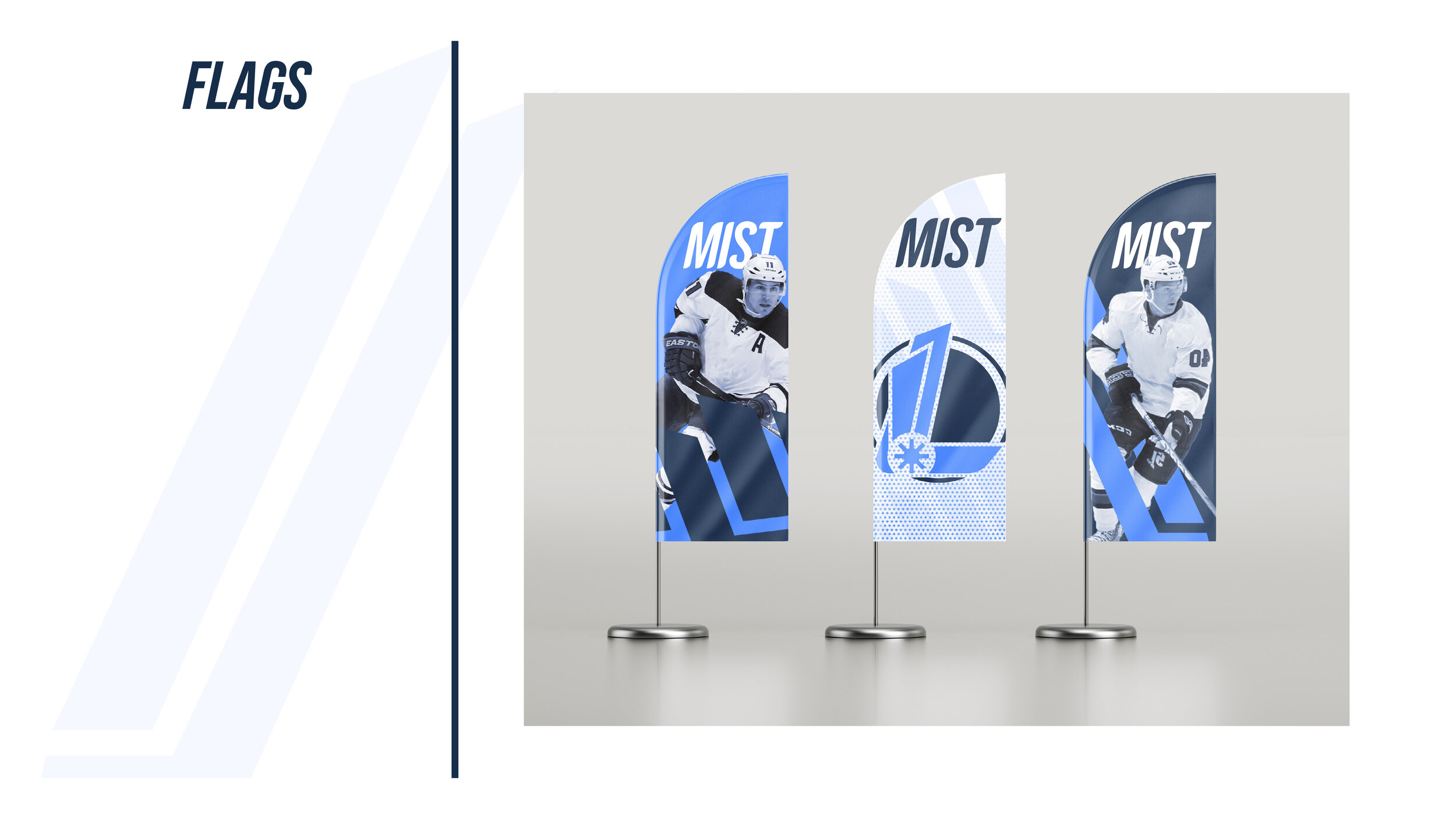
The Louisville Mist are the newest team in the National Hockey League. Inspired by the foggy and mysterious mornings on the Ohio river, their branding uses sharp shapes in combination with an abstracted anatomy of a steamboat, a type of transportation that has deep roots within the city of Louisville. The team’s logomark is crafted with these different visual elements in a way that allows it to represent both the impact of the river, as well as the smooth and sharp movement of The Mists’ many talented players. Throughout the team’s visual identity, the steamboat wheel icon appears as a simple representation of the team, usually accompanied by sharp and curvy shapes reminiscent of the teams logomark. These purposeful and meaningful pieces of the team’s visual identity help each element leave an impactful reminder of what they represent.


